You’ve got your iPad and Apple Pencil ready to go. Now it’s time to dive into the vibrant world of digital art with Procreate. But wait – before you start creating, you need the right colors to bring your vision to life.
The right color palette can make or break your digital artwork. That’s why we’ve put together a list of 10 Procreate Color Palettes. These color schemes will help you create stunning pieces, whether you’re into portraits, landscapes, or abstract art. Get ready to take your digital creations to the next level with these game-changing palettes.
1) Sunset Boulevard
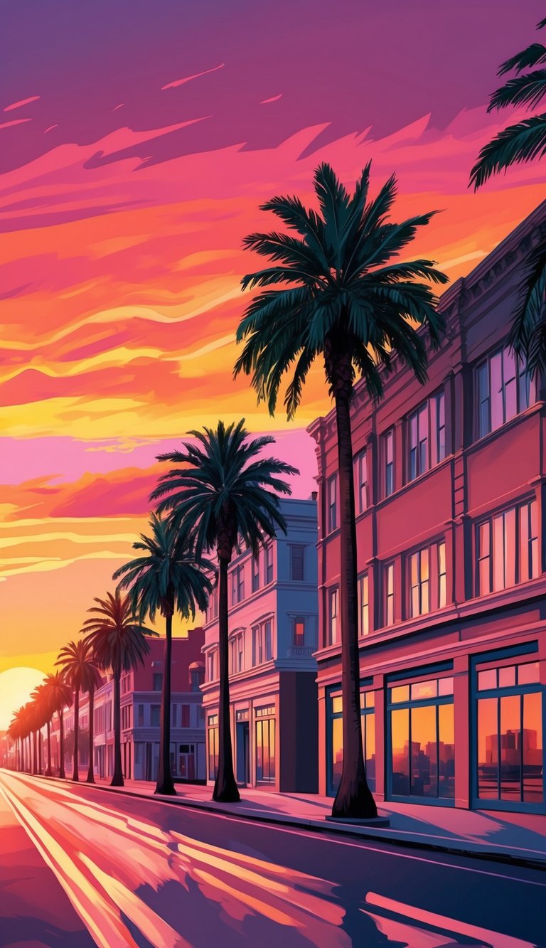
Sunsets are a favorite subject for digital artists. The Sunset Boulevard color palette captures the warm, glowing hues of a beautiful twilight sky.
This palette includes rich reds, oranges, and yellows that blend seamlessly. You’ll find shades perfect for creating stunning sunset scenes in your digital artwork.
With these colors, you can paint vibrant skies that range from soft pastels to deep, fiery tones. The palette also features some cooler blues and purples for contrast.
Try using the lighter shades near the horizon and darker ones higher in the sky. This technique helps create depth and realism in your sunset illustrations.
The Sunset Boulevard palette isn’t just for landscapes. You can use these warm colors to add a cozy glow to portraits or still life pieces too.
Experimenting with different color combinations from this palette can lead to unique and eye-catching results. Don’t be afraid to mix and match to find your perfect sunset blend.
2) Ocean Dreams
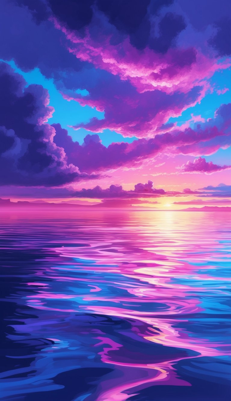
Are you looking to capture the serene beauty of the sea in your digital art? The Ocean Dreams color palette is a must-have for your Procreate collection. This set of hues brings the calming essence of ocean waves to your fingertips.
With Ocean Dreams, you’ll find a range of blues that mimic the depths of the sea. From light turquoise to deep navy, these shades allow you to create stunning underwater scenes.
The palette also includes sandy beiges and foamy whites. These colors help you add realistic touches to your beach and shoreline illustrations. You can easily paint crashing waves or tranquil tides with this versatile set.
Don’t forget about the greens! Ocean Dreams offers various aqua and teal tones. These colors are perfect for depicting seaweed, coral reefs, or the play of light on water surfaces.
The Ocean Dreams Swatches for Procreate come with 7 swatches and 210 colors. This wide selection gives you plenty of options to bring your oceanic visions to life.
Whether you’re drawing mermaids, tropical fish, or coastal landscapes, this palette has got you covered. It’s an essential tool for any artist who loves to create sea-inspired digital art.
3) Retro Vibes
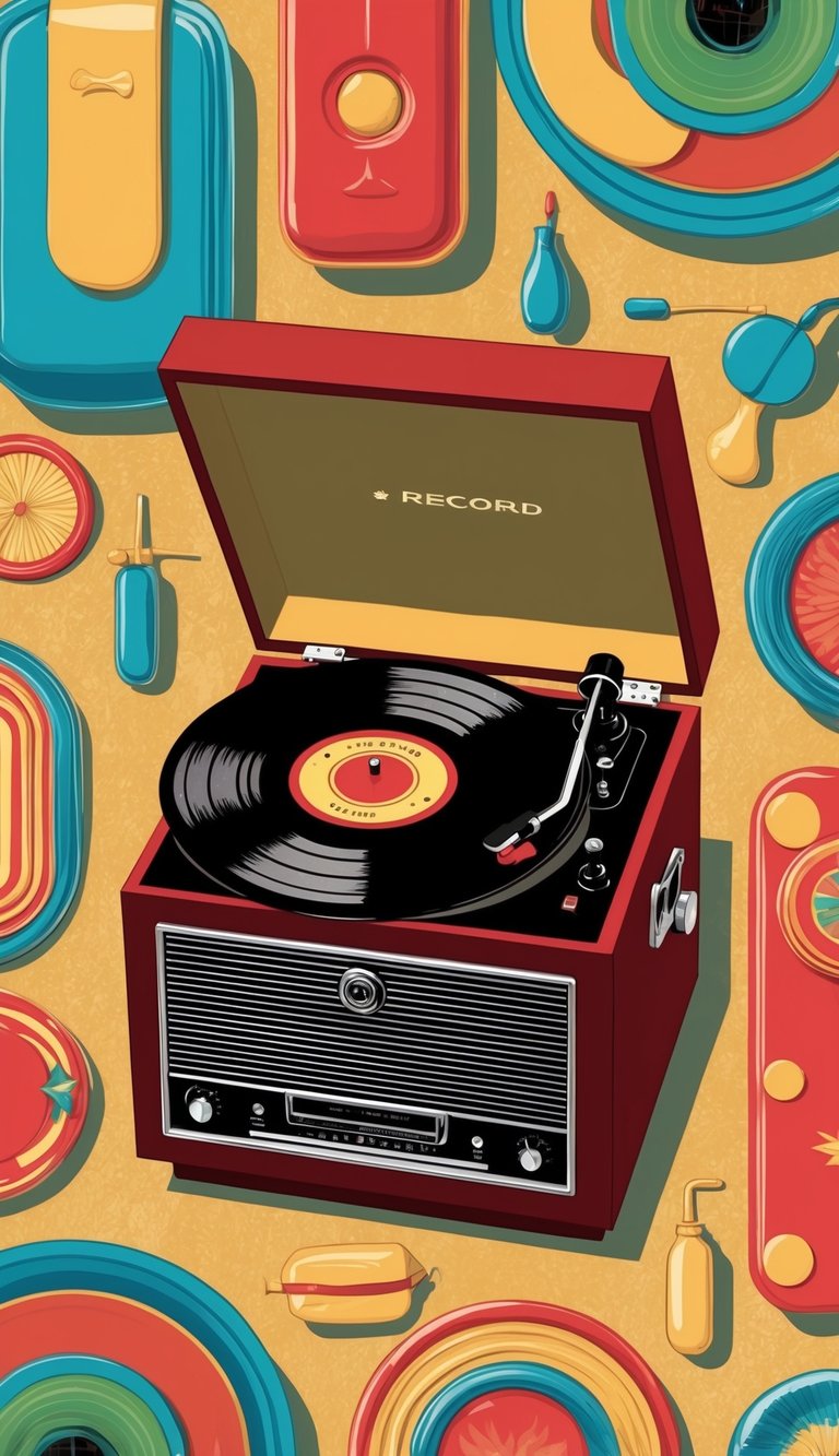
Want to add some nostalgic flair to your digital art? Retro color palettes are super trendy right now. They can give your work a fun, vintage feel that’s sure to catch the eye.
You can find free retro Procreate palettes online, like the groovy “That 70s Palette” by Retro Supply Co. These palettes often feature warm, muted tones that were popular in past decades.
Think oranges, browns, and avocado greens for a 70s vibe. Or try pastels and neons for an 80s look. You can even go for muted earth tones to capture a 60s aesthetic.
Using retro palettes can transport your artwork to a different era. They’re great for creating vintage-style posters, album covers, or illustrations with a touch of nostalgia.
Don’t be afraid to experiment with these fun color schemes. Mix and match different retro palettes to create your own unique style. Your digital art will stand out with these cool, throwback vibes.
4) Neon Jungle
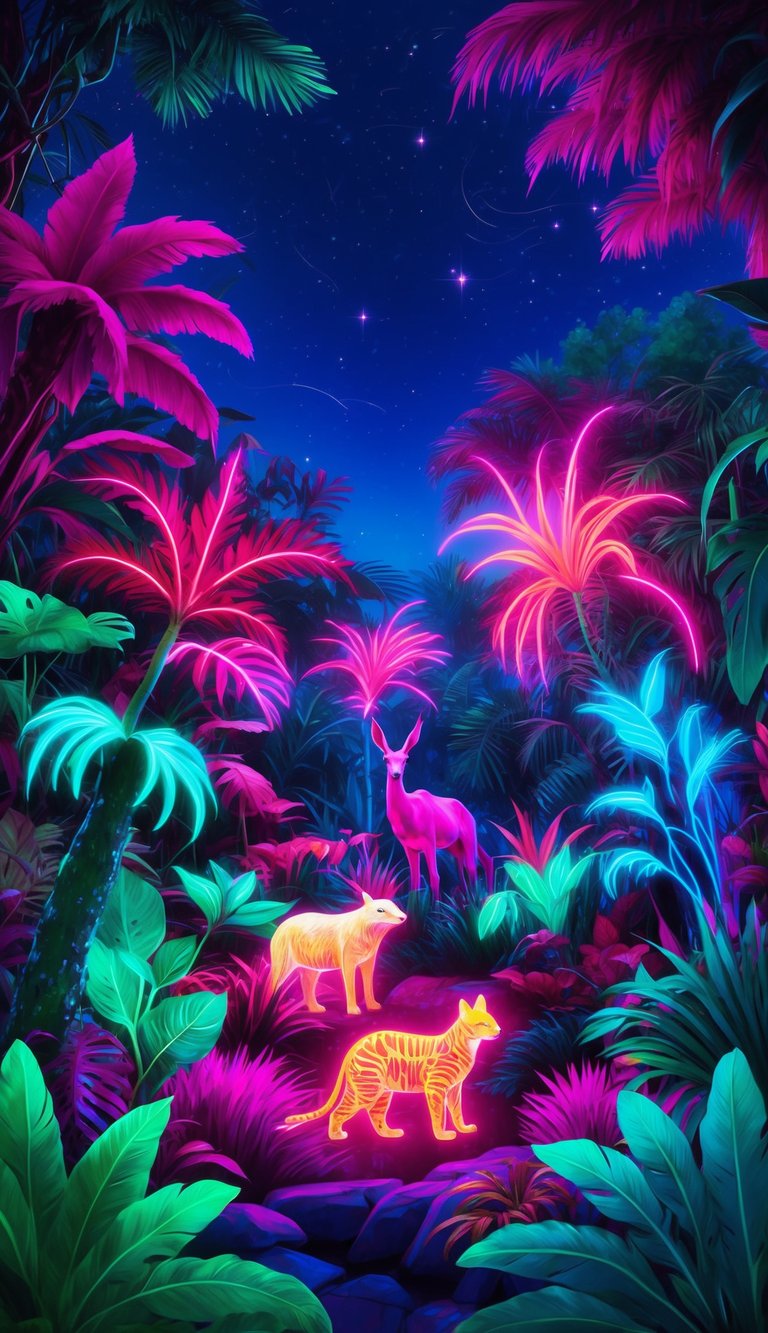
Looking to add some electrifying vibrancy to your digital art? The Neon Jungle palette is your go-to choice. This color scheme combines vivid greens with eye-catching neon hues to create a truly energetic vibe.
You’ll find shades like #1B5E20 and #76FF03 in this palette. These colors work together to give your artwork a fresh, lively feel that’s perfect for nature-inspired pieces with a modern twist.
The Neon Jungle palette is great for creating digital illustrations of tropical scenes or futuristic landscapes. It’s also ideal for designing eye-catching posters or social media graphics that need to stand out.
When using this palette, try balancing the brighter neons with the deeper greens. This will help your art pop without overwhelming the viewer. You can use the neon colors for highlights or focal points in your piece.
Remember, a little neon goes a long way. Start with small accents and build up if you want a bolder look. This palette is all about having fun and letting your creativity shine through your digital art.
5) Vintage Pastels
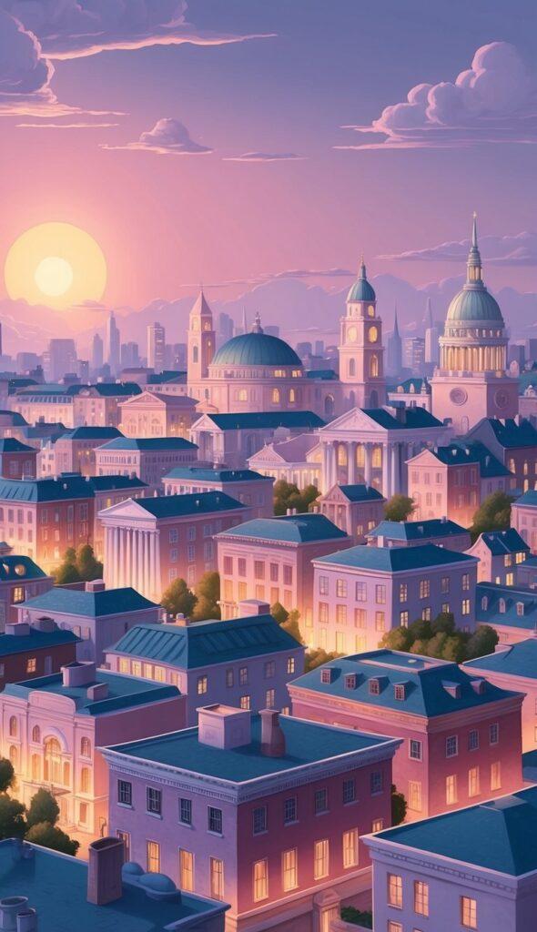
Vintage pastels are a must-have for digital artists working in Procreate. These soft, muted colors bring a nostalgic feel to your artwork.
You’ll find these palettes perfect for creating retro-inspired designs or adding a touch of yesteryear to your illustrations. Retro color schemes are super popular in digital art right now, so having a vintage pastel palette is essential.
These palettes often include faded pinks, muted blues, and soft yellows. They’re great for creating dreamy landscapes or charming character designs.
You can use vintage pastels to give your work a gentle, soothing vibe. They’re especially useful for children’s book illustrations or vintage-style poster designs.
Don’t forget to experiment with blending these colors. Mixing vintage pastels can create beautiful, subtle gradients that add depth to your artwork.
When you’re looking for free Procreate palettes, keep an eye out for vintage pastel options. They’re a versatile addition to any digital artist’s toolkit.
6) Autumn Breeze
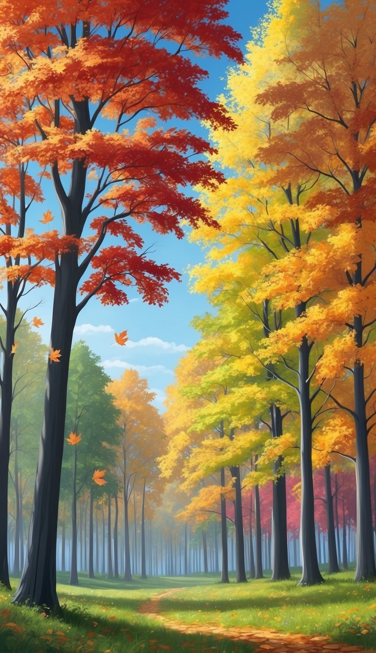
The Autumn Breeze color palette captures the cozy feel of fall. It’s perfect for your digital art projects that need a warm, inviting touch.
This palette includes rich oranges, deep reds, and golden yellows. These colors remind you of crisp leaves and pumpkin patches. You’ll also find earthy browns and soft greens to round out the mix.
With Autumn Breeze, you can create artwork that feels like a crisp fall day. Use it to add depth to your landscapes or bring life to your nature-inspired pieces.
The colors work well together, making it easy to blend and create eye-catching art. You’ll find that this palette helps you express the magic of autumn in your digital creations.
Try using Autumn Breeze for illustrations of cozy scenes. Think steaming mugs of cider, comfy sweaters, and golden sunsets. It’s also great for adding a seasonal touch to your lettering projects.
7) Tropical Escape

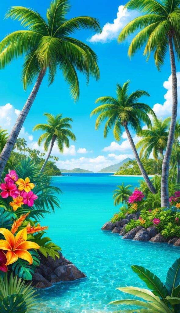
Want to bring some island vibes to your digital art? A tropical color palette is just what you need. These bright and lively hues will transport your viewers to a sunny paradise.
Picture the colors of a tropical beach: turquoise waters, golden sand, and vibrant flora. That’s what you’ll get with a tropical escape palette. It’s perfect for creating summer-inspired Procreate art.
You can use these colors to paint serene beach scenes or energetic tropical flora. The bright and lively hues will make your artwork pop off the screen.
Looking for a specific tropical palette? Check out the tropical color palette by Denise Anne. It’s a great addition to your Procreate collection.
With a tropical escape palette, you can easily create artwork that feels warm and inviting. It’s like a mini-vacation for your eyes every time you use it.
8) Urban Grunge
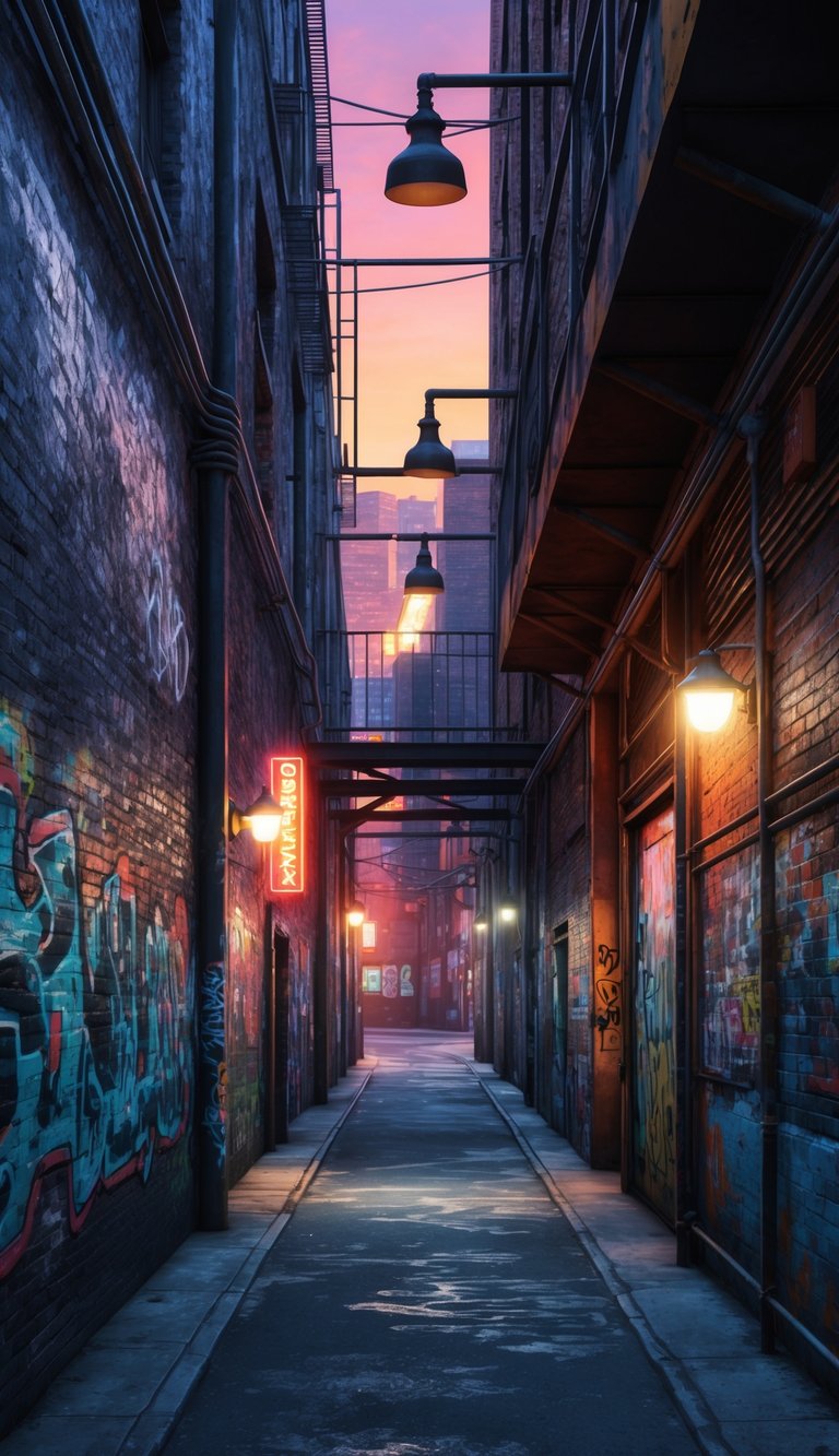
Hey, digital artists! Ready to add some edge to your Procreate creations? The Urban Grunge color palette is your go-to for that gritty, street-art vibe.
This palette mixes dark, moody tones with pops of vibrant colors. Think concrete grays, rusty browns, and deep blacks paired with splashes of neon pink or electric blue.
You’ll find these colors perfect for creating diverse themes in your digital art. Use them to design edgy street scenes, graffiti-inspired pieces, or moody cityscapes.
The Urban Grunge palette lets you capture the raw energy of city life. Mix and match these colors to add depth and texture to your work.
Want to try something new? Use this palette for portrait artwork with an urban twist. The contrasting colors can create striking effects in your digital paintings.
Remember, you can always tweak these colors to suit your style. Experiment with different combinations to find what works best for your unique artistic vision.
9) Mystical Forest
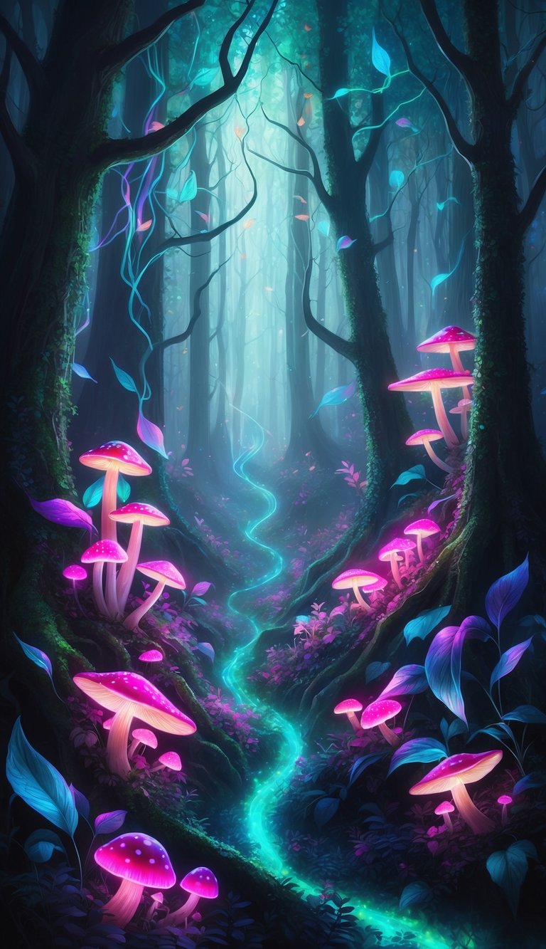
Looking to create enchanting digital art? The Mystical Forest color palette is a must-have for your Procreate collection. This magical set of hues will transport your artwork to a world of wonder and mystery.
Picture deep, rich greens paired with misty blues and purples. Add in touches of golden sunlight filtering through dense foliage. These colors work together to create an atmosphere of secrecy and allure in your digital paintings.
You’ll find this palette perfect for crafting fantastical forest scenes, fairy-tale illustrations, or even moody landscape backgrounds. The versatile shades allow you to paint everything from mossy tree trunks to shimmering fairy wings.
With the Mystical Forest palette, you can easily add depth and dimension to your artwork. Use darker tones for shadowy areas and lighter hues to highlight magical elements. This combination of colors will help your creations pop off the screen.
Don’t forget to experiment with blending these colors. You might discover new, exciting shades that enhance the mystical feel of your digital art even more. Let your imagination run wild in this enchanted color scheme!
10) Serene Sky
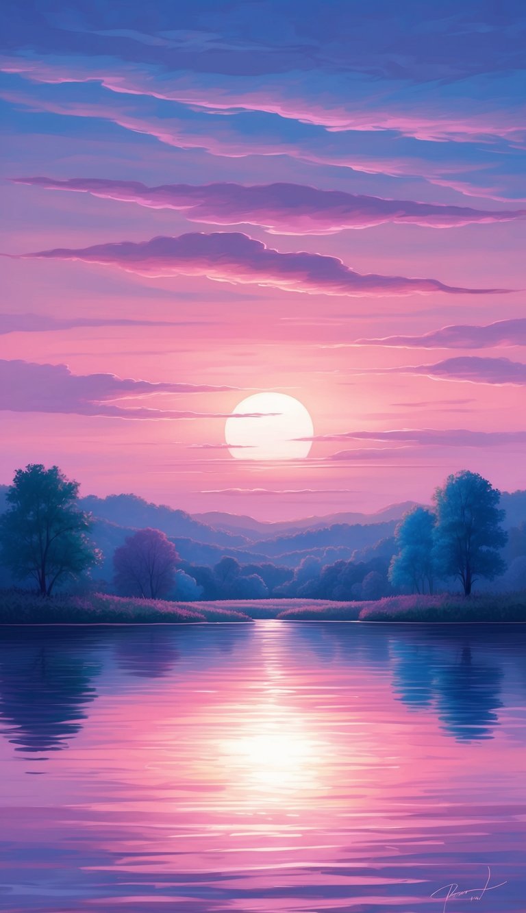
Looking to add some peaceful vibes to your digital art? The Serene Sky palette is just what you need. This soothing collection of colors captures the essence of a calm, clear day.
You’ll find a range of soft blues that mimic the sky’s gentle hues. These shades work perfectly for creating dreamy backgrounds or adding a touch of tranquility to your pieces.
The palette also includes subtle whites and grays for cloud details. These colors help you add depth and dimension to your sky scenes without overpowering the calming blue tones.
Don’t forget about the warm, golden hues included for sunrises and sunsets. These colors let you add a touch of magic to your sky-themed artwork, creating stunning visual effects.
Whether you’re working on landscapes, backgrounds, or atmospheric pieces, the Serene Sky palette has got you covered. It’s versatile enough for various styles, from realistic to more abstract interpretations of the sky.
With this palette, you can easily create art that brings a sense of peace and serenity to viewers. Give it a try in your next Procreate project and watch your skies come to life.
Understanding Color Theory
Color theory is key for digital artists. It helps you pick colors that work well together and create the right mood. Let’s look at some important parts of color theory.
The Basics of Color Harmony
Color harmony is about choosing colors that look good together. The color wheel is a helpful tool for this. It shows how colors relate to each other.
There are a few main types of color harmony:
- Monochromatic: Using different shades of one color
- Analogous: Using colors next to each other on the wheel
- Complementary: Using colors opposite each other on the wheel
When you use these in Procreate, your art will look more put together. Try making a piece with just blue shades for a calm feel. Or use red and green for a bold look.
Contrast and Complementary Colors
Contrast is the difference between colors. It can make your art pop. Complementary colors are great for high contrast.
Here’s how to use contrast in your work:
- Pick a main color
- Find its opposite on the color wheel
- Use both in your piece
For example, purple and yellow are opposites. Using them together will make your art stand out. You can also play with light and dark versions of colors for contrast.
Procreate has tools to help you find complementary colors. Try the color picker to find exact opposites. This can help you make eye-catching art quickly.
Customizing Your Procreate Workspace
Procreate lets you set up your workspace just how you like it. You can organize your color palettes and save your favorites for easy access.
Setting Up Your Color Palette Library
To set up your color palette library, tap the Colors icon in the top right corner. This opens the Colors panel. Here, you’ll see the Palettes tab.
Tap the + button to add a new palette. You can create one from scratch or import existing palettes.
To organize your palettes, tap and hold to drag them into your preferred order. You can also rename palettes by tapping the name.
For quick access, set your favorite palettes as default. Just swipe left on a palette and tap “Set Default”.
Compact and Card views let you see your palettes differently. Tap “Compact” or “Cards” at the top to switch between them.
Saving and Sharing Your Procreate Color Palettes
Once you’ve made a palette you love, you’ll want to save and share it.
To save a palette, tap the + button in the Palettes tab and choose “Create New Palette”. Give it a name and start adding colors.
To add a color, tap the + in your new palette. Use the color picker to choose your shade.
Sharing is easy too. Tap the palette you want to share, then tap the share icon. You can send it via email or AirDrop.
You can also export your palette as a .swatches file. This lets you use it in other apps or share with friends.
Remember, you can always edit your palettes later. Just tap a color to change it or delete it. And, if you want to learn more about color palettes, check out our full guide: How to Create Color Palettes in Procreate.
Beginner’s Guide to Procreate
Our Beginner’s Guide to Procreate is the ultimate resource to kickstart your digital art journey. It covers everything from the basics of navigating the app to advanced techniques for creating stunning artwork so that you can not only get off to a strong start but gain confidence quickly. Dive in and unleash your creativity with Procreate!

