Creating color palettes in Procreate is an essential skill that allows you to capture and organize your preferred colors for any project. This versatile feature of the popular digital illustration app empowers you to save your favorite hues as swatches and arrange them into harmonious groups. Whether you’re preparing for a new project or streamlining your workflow for existing designs, understanding how to efficiently create and manage color palettes can significantly enhance your creative process.
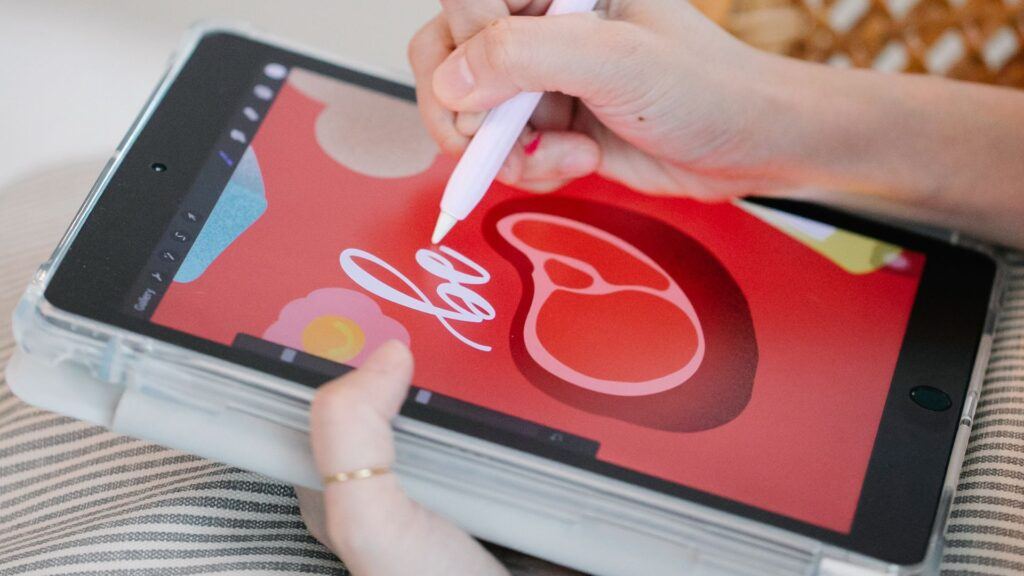
Procreate’s intuitive interface makes it easy to create a new palette. You can start with the app’s pre-existing selection of colors or use the color picker to choose specific colors from your artwork or import them from external sources. Each color you select can be added to your palette, allowing for quick access later. You have the flexibility to name and reorder your palettes, which helps keep your digital workspace organized.
Getting Started with Procreate

As you venture into the world of digital art with Procreate on your iPad, mastering the workspace and gaining an understanding of color theory is essential. Crafting your color palettes will become a cornerstone of your artistic process, providing inspiration and consistency to your work.
Understanding the Procreate Interface
When you launch Procreate, you’ll notice a streamlined interface designed for intuitive navigation. The main areas you’ll interact with include:
- Toolbar: Located at the top, providing quick access to painting tools.
- Layer Panel: On the right, for managing and manipulating layers.
- Color Panel: Also on the right, which can be expanded to reveal your Palette Library—a place where you can store and organize your custom color palettes for easy accessibility.
- Brush Library: To select and customize brushes that fit your artistic style.
Getting familiar with these sections will speed up your workflow and allow you to focus more on creating.
Fundamentals of Color Theory
Good color choices stem from a solid understanding of color theory, which includes:
- Hue: The base pigment of your color. Think of it as a point on the color wheel.
- Saturation: The intensity or purity of a color. High saturation means vivid colors, while low saturation results in muted tones.
- Value: How light or dark a color is, which can be adjusted to add depth and dimension to your artwork.
Consider the relationships between colors to achieve the desired contrast and harmony in your compositions.
Importance of a Color Palette
A thoughtful color palette:
- Helps maintain a consistent color scheme throughout your piece.
- Can convey specific moods and styles.
- Allows for quick access to your favorite hues, enhancing efficiency.
Utilize the Palette Library in Procreate to save and organize your palettes, ensuring your chosen colors match your vision and source of inspiration. As an artist, this preparation enables you to focus more on the creation process, with your ideal palette at your fingertips.
Creating Your First Palette

In Procreate, creating a color palette is a straightforward process that allows you to store and organize your favorite colors. Whether you’re working on canvas or planning ahead, these steps will help you build a custom palette with ease.
Using the Procreate Color Picker
To start making your palette, activate the Color Picker by tapping on the current color in the top-right of your canvas. Within the picker, you have a color wheel and sliders for fine-tuning hues. Once you’ve selected a color, press and hold a square in the default palette to add it as a new swatch.
Selecting Colors from Photos
You can create a palette using colors from your photos. To do this, import an image from your Photos app or Camera Roll into your canvas. Use the eyedropper tool to pick colors directly from the photo and add them to your palette by tapping an empty swatch spot.
Adding Swatches Manually
To add swatches manually, select the desired color using the Color Picker or Eyedropper Tool. Once selected, return to your palette and touch an empty square to save the color to your palette. Repeat this process to continue adding a variety of colors.
Working with the Palette Library
Your Palette Library is where all your created palettes are stored. To create a new palette, navigate to the library and tap the + icon. As you add palettes, Procreate automatically organizes them, but you can also reorder palettes manually if preferred.
Organizing Your Palettes
To organize your palettes, simply press and hold a palette to move it within the library. If you need to edit, reorder swatches, or delete palettes, tap on the desired palette and select the needed option. This helps maintain a tidy workspace where your color schemes are easily accessible.
Advanced Techniques for Creating Color Palettes in Procreate

When developing color palettes in Procreate, it’s crucial to tap into sophisticated methods that elevate your artwork. By sourcing inspiration, analyzing harmonious color schemes, and understanding color relationships, you can create palettes that bring cohesiveness and appeal to your digital art.
Drawing Inspiration from Nature and Images
Your environment is a treasure trove of color schemes, and nature is one of the richest sources. Take photos with your camera roll or source images from platforms like Pinterest or Unsplash to capture the colors you encounter. Within Procreate, the palette capture tool allows you to select hues directly from these images. Aim for a harmony amongst the colors to ensure a cohesive look in your palette.
- Use the eyedropper tool to select specific colors from your photos.
- Procreate’s palette capture feature can automatically extract a series of colors from an image to start your palette.
Creating Palettes from Artwork
Leverage existing artwork or paintings—yours or those by others—that embody a color scheme you admire. Analyze these pieces and extract colors to form a foundational palette. If you are drawing inspiration from digital art, import the artwork into Procreate and use the color picker to sample colors. For traditional painting, capture the colors using your device’s camera and utilize the palette capture tool in Procreate to extract the palette.
- Digital Art: Use the color picker to sample colors directly.
- Painting: Take a photo and extract the palette in Procreate.
Understanding Color Relationships
Apply your knowledge of color theory when building palettes to ensure that the colors you choose work well together. Whether you aim for an analogous, triadic, tetradic, complementary, or split complementary scheme, each offers a different type of harmony.
- Analogous: Colors next to each other on the color wheel; creates a serene and comfortable design.
- Complementary: Opposite colors; offers a high-contrast, vibrant look.
- Triadic: Three evenly spaced colors; provides a rich, dynamic feel.
- Tetradic: Two sets of complementary colors; great for a complex and nuanced palette.
- Split Complementary: A base color plus two adjacent to its complement; balances contrast and harmony.
Use these relationships to guide your selection process, assuring a pleasing and well-coordinated color palette for your projects.
Digital Art and Color Application
When you embark on creating digital art in Procreate, understanding how to manipulate color effectively is critical. Your art comes alive through strategic application and layering of hues, mastering the dynamics of your digital brushwork, and perfecting the interplay of light and shadow.
Color Dynamics in Digital Brushwork
To truly bring your artwork to life, grasp the HSB (Hue, Saturation, Brightness) model to fine-tune the colors on your palette. As you paint, consider adjusting these settings to create color variety with your brushes. Techniques such as altering hue on-the-fly can replicate the dynamic color shifts seen in natural light.
- Hue: Shifts the actual color you’re using.
- Saturation: Adjusts the intensity of the color.
- Brightness: Controls the lightness or darkness of the color.
In Procreate, brushes can also be customized for color dynamics, enabling the colors to change with each stroke depending on the chosen settings.
Layering Colors in Procreate
Successful layering is a cornerstone of digital art, enabling you to construct your image with versatility. Procreate’s layers feature allows you to apply colors in a non-destructive manner, meaning you can edit them individually without affecting the rest of your artwork.
Here’s a simple guideline for layering:
- Base Layer: Start with flat colors, laying the foundation for your artwork.
- Detailing Layers: Add subsequent layers for more detailed regions of color.
- Adjustment Layers: Utilize these layers to tweak the colors, such as changing their saturation or brightness.
Layering not only helps you organize your color application but also allows for easier adjustments as your artwork progresses.
Perfecting Highlights and Shadows
Highlights and shadows give your artwork dimension and form. In Procreate, use lighter and darker color swatches to sculpt the surfaces within your image. Pay attention to the color temperature of your highlights and shadows; warm highlights can make an object appear closer, while cool shadows can make it recede.
Here are the steps for applying highlights and shadows:
- Select Your Light Source: Determine where the light in your composition comes from.
- Apply Highlights: Choose a lighter version of your flat color and apply where the light naturally hits.
- Apply Shadows: Choose a darker shade and apply to areas that are away from the light source.
Mastering these techniques allows you to elevate your digital artwork with a tangible sense of realism and depth.
Palette Customization and Sharing
Customizing your palette in Procreate enhances the coherence of your artwork, while sharing allows for collaboration and inspiration exchange. Mastering these aspects can elevate your digital artistry.
Editing and Adjusting Swatches
To tailor color swatches to your precise needs, tap on a color square within your palette to bring up the Color Picker, where you can refine the hue using sliders for HSB, RGB, or hexadecimal values. Feel free to:
- Add new swatches by tapping an empty square.
- Edit existing swatches using the Color Picker for fine adjustments.
- Drag and drop swatches to reorder them, catering to the flow of your artistic process.
Importing and Exporting Palettes
You can easily import palettes you’ve created or found online directly into Procreate, which accepts files in .swatch format, and even images like PNG or JPEG that contain the colors you desire. Use these steps to handle palettes:
- Import: In ‘Palettes,’ tap the ‘+’ and choose ‘Import’ to select a compatible file.
- Export: Share your custom palette by swiping left on it and tapping ‘Share’ to send as a .swatch file or an image.
This feature is ideal for backing up your palettes or for sharing them with others via email or cloud storage.
Leveraging Online Resources and Communities
Discovering new palettes and drawing inspiration from others can be done through platforms like Pinterest and Instagram. Look for:
- Unsplash: High-quality images to sample colors from.
- Canva: Palette suggestions and inspiration.
When sharing your palettes, include affiliate links if you’re collaborating with brands, leading your followers to the products you used. Sharing and engaging with palettes can grow your online presence and contribute to the creative community.
For a full tutorial on How to Draw on Procreate, be sure to check out our complete guide.
Tips and Tricks
Before diving into the technicalities, understand that Procreate equips you with intuitive palette tools to create stunning color collections for your digital art projects. Mastering these tools will elevate your illustrations, whether they reflect the vivacity of a rainbow or the subtlety of watercolor tones.
Utilizing Procreate’s Palette Tools
- Palette Capture: Create palettes instantly from your environment using the camera on your iPad. Simply point and capture, and Procreate will generate a palette based on the colors detected.
- Swatches: These are the foundation of your palette. You can tap and hold on any color in your illustration to select it with the eyedropper tool and then slide it into your palette.
Compact and Cards View:
- Compact View: Offers you a more streamlined look, displaying your swatches in small squares. It’s ideal when screen real estate is at a premium.
- Cards View: This layout shows larger squares, making it easier to differentiate between similar shades. Swatches in this view are more accessible if you’re working with a nuanced palette, such as pastels.
Color Panel Options:
- Classic: If you’re looking for a traditional color wheel to select and adjust your colors, this mode is your go-to.
- Compact: This mode presents colors in a strip, allowing for quick selection without leaving the canvas area.
- Automatic Color Palettes: Procreate can automatically generate color palettes from imported photos. Simply select an image from your gallery, and let the app create a palette based on the main colors in the photo.
For color palette ideas to inspire you, check out 10 Procreate Color Palettes Every Digital Artist Needs.
Maintaining a Palette Collection

When managing your color palettes in Procreate, it’s essential to keep your collection organized and accessible. Effective organization helps streamline your workflow and ensures you can quickly find the colors you need for your projects.
Organizational Strategies and Best Practices
Your Palette Library in Procreate can become extensive, especially if you engage in numerous projects with different color needs. To maintain order:
- Reorder Palettes: Hold and drag palettes around the Palette Library to reorder them according to your workflow or project requirements.
- Reorder Swatches: Within each palette, you can tap, hold, and drag swatches to rearrange them, aiding in visual grouping and gradient formation for smoother transitions.
- Naming Conventions: Use clear and descriptive names for your palettes to easily identify them later.
By maintaining a well-organized Palette Library, you save time and avoid disruptions when selecting colors during your artistic process.
Utilizing Color Cards and Compact Views
Procreate offers two major views for color selection:
- Cards View: This is the default view where you see large swatches of your colors. It’s useful for a detailed look at your palette, making it easier to select the exact hue you’re after.
- Compact View: Activate the compact view by tapping the name of your current palette and selecting ‘Compact’. This provides a more condensed version of your palette, showing more colors on the screen at once which is great for tablets with smaller displays.
Both views retain the functionality to reorder swatches, ensuring that you can organize your palettes efficiently, no matter how you prefer to view them. Switching between the views can be done with a simple tap, allowing you to adjust your experience to match your current task or preference.
Troubleshooting Common Palette Issues
When working with color palettes in Procreate, you might encounter import and export difficulties. This section will guide you through resolving these issues to maintain a seamless workflow.
Resolving Import/Export Problems
If you’re having trouble importing palettes into Procreate, ensure the file format is correct. Procreate palettes should be in .swatch format. Try the following steps:
- Check File Compatibility: Confirm that the file you’re trying to import is a .swatch file, as Procreate does not support other formats for palettes.
- Update Procreate: Running an outdated version of the app can cause import issues. Update to the latest version to resolve these problems.
Exporting issues often occur due to missteps in the saving or sharing process. To export a palette, touch the palette in your Palette Library and choose “Share.” Remember to select a compatible format for the platform you’re sharing with.
- File Access Permissions: If Procreate can’t export the palette, check your iPad’s privacy settings to ensure that Procreate has access to your photos and files.
- Use Procreate’s Share Options: Export directly through Procreate’s sharing options to ensure compatibility.
For involving the iPad camera in palette creation:
- Ensure Camera Permissions: Procreate needs camera access to create palettes using the iPad camera. Go to your iPad’s settings, find Procreate, and toggle on the camera permission.
- Stable Lighting Conditions: For best results when capturing colors with the camera, use stable and neutral lighting to avoid color inaccuracies.
Remember, handling .swatch files outside Procreate requires a compatible device or application that can recognize this specific file type.
Beginner’s Guide to Procreate
Our Beginner’s Guide to Procreate is the ultimate resource to kickstart your digital art journey. It covers everything from the basics of navigating the app to advanced techniques for creating stunning artwork so that you can not only get off to a strong start but gain confidence quickly. Dive in and unleash your creativity with Procreate!
Frequently Asked Questions
Navigating the creation and management of color palettes in Procreate is essential for efficient digital artistry. The information below addresses common inquiries related to palette manipulation within the app.

