Embarking on the journey of digital lettering can be as thrilling as discovering a hidden trail in the woods—mysterious initially, but invigorating once you’re on the path. Have you ever tapped into the boundless world of Procreate on your iPad, armed with an Apple Pencil and a surge of creativity? It’s not just any digital art software; it’s a powerful, comprehensive tool designed to bring your lettering fantasies to vibrant life right on the screen before you.
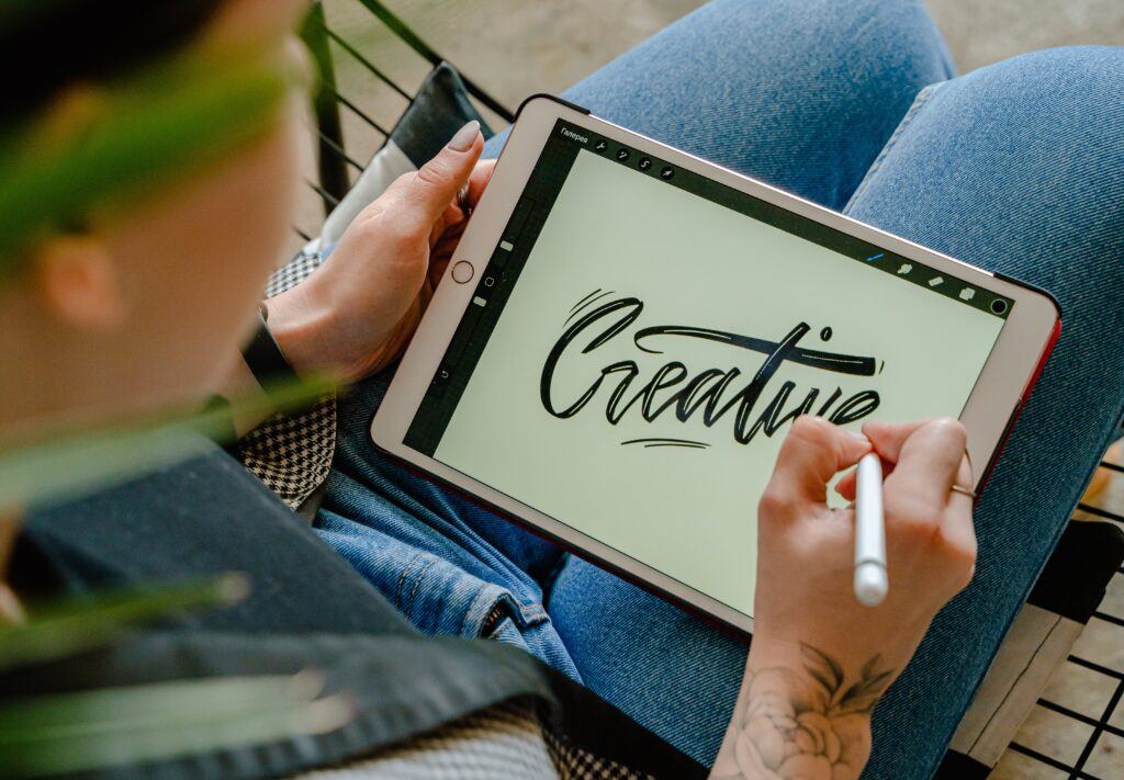
What sets Procreate apart is its intuitive interface that feels almost natural, even if you’re a newbie. With a few swipes and taps, you can find yourself selecting from an array of brushes or adjusting layers as if they were second nature. And with the convenience of your iPad, it’s like carrying an entire artist’s studio in your bag—with no mess and fuss.
Imagine the glee of having all the lettering styles at your fingertips, from elegant calligraphy to bold, contemporary types. And the best part? You don’t have to wait for ink to dry! The magic of Procreate’s lettering capabilities lies in its versatility and the freedom it provides you to experiment and fine-tune your typography until it’s just perfect—without the pressure of permanence that comes with traditional mediums. Ready to dive in and see what your very own strokes can create?
Getting Started with Procreate for Lettering
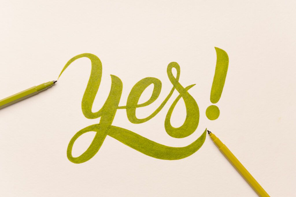
You’ve got your iPad, Apple Pencil and a fire to create beautiful lettering. Let’s get you set up on Procreate, where the magic happens!
Understanding the Procreate Interface
Procreate’s interface is your canvas for creativity, so getting familiar with it is key. Your Brush Library is a powerhouse filled with pre-made and customizable brushes perfect for various lettering styles. Don’t miss exploring the Layers panel, where you can manage the complexity of your designs. Tired of a mistake? The Actions panel is your go-to for undoing oops moments.
Choosing the Right iPad and Apple Pencil
Pairing the right tools is like choosing the best sneakers for a marathon – it matters. Any iPad compatible with an Apple Pencil will work, but the newer models offer more sensitivity and performance. As for the Apple Pencil, it’s a no-brainer, the second generation gives you more precision and the feel of a real pen.
| Model | Compatibility | Notes |
|---|---|---|
| iPad Pro | Apple Pencil 1st & 2nd | Best performance |
| iPad Air | Apple Pencil 1st & 2nd | Good balance of cost and features |
| iPad Mini | Apple Pencil 1st | Compact size for portability |
| iPad | Apple Pencil 1st | Most affordable option |
Setting Up Your Canvas for Lettering Projects
Before you dive into lettering, create a Procreate file tailored to your project. Start with a custom Canvas size: if you’re designing for print, 300 DPI is your best friend. For digital, consider the final display size. Add a touch of magic with backgrounds: A subtle texture can really make your letters pop.
- Open Procreate and tap the ‘+’ icon.
- Select ‘New Canvas’ > ‘Create Custom Size’.
- Input size and DPI. For web, 72 DPI is cool. For print, aim higher – 300 DPI.
- Tap ‘Create’ and voila! Your canvas awaits.
And just like that, you’re ready to begin your lettering journey with Procreate. Grab that Apple Pencil, and let’s get those creative juices flowing!
Basic Lettering Techniques
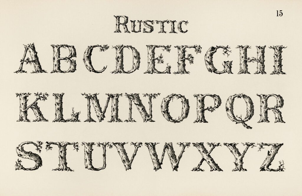
Starting your journey into the realm of Procreate lettering? You’ve opened the door to a world where your fingertips unleash creativity. Keep in mind that every masterful piece begins with understanding the ropes, so let’s jump right in.
The Art of Hand Lettering
Think of hand lettering as the personal touch in a typed world. It’s your unique script coming to life on the digital canvas. Remember:
- Consistency: Your letters need to play well together. Aim for uniformity in size and spacing.
- Emphasis: Give life to your words by bolding or italicizing important parts.
To kick off, try sketching your letters with a simple pencil brush before inking them over. You’ll be surprised how a little planning can make your work pop!
Fundamentals of Brush Lettering
Brush lettering with Procreate is like a dance where your stylus leads. Here’s a quick guide:
- Pressure Sensitivity: Apply pressure for thick downstrokes, lighten up for those delicate upstrokes.
- Streamline Feature: Procreate’s Streamline function smooths out your strokes, making brush lettering a breeze.
Tackling the basics is like starting a good habit. Focus on maintaining even pressure and don’t be afraid to go back and ‘undo’ to make it just right.
Exploring Various Lettering Styles
Your style is your signature. It’s what sets your work apart. Consider these tips:
- Experiment: Try out different brush types to see what strokes resonate with your personal flair.
- Layering: Layers are your best friends. Use them to tweak and refine without affecting your main work.
From serif to sans, from bold to whimsical, stretch your creative muscles and explore. Combine elements from different styles and create a hybrid that’s all yours. Isn’t it exciting to see your lettering evolve? Keep pushing the boundaries, and most importantly, have fun with it!
Mastering Brushes and Tools
Ready to take your Procreate lettering up a notch? Your journey towards mastery hinges on understanding brushes, custom tools, and a few ingenious features Procreate offers.
Using Procreate Brushes for Lettering
Ever wonder why your lettering doesn’t pop like the pros? It’s all about the brush you wield! Take “Grid Builder – Layout Composer” for example; it’s a game-changer for composing layouts with geometrical precision. And don’t miss out on versatile options like the “KickOff Lettering Toolbox,” designed for beginners and pros alike. Here’s a quick tip – adjust your brush settings for streamlining to achieve that silky smooth curve.
- Favorite Brushes for Newbies:
- The Ultimate Lettering and Calligraphy Procreate Kit
- Procreate Lettering Starter Pack
- For the Seasoned Artist:
- Slayout Lettering Masterclass
- Procreate Lettering Toolkit
Remember, practice makes perfect. The more you experiment with different brushes, the more you’ll understand which one suits your unique lettering style.
Custom Brushes and the Brush Library
Feeling adventurous? Why not create your own custom brush? Your imagination is the limit when it comes to creating the perfect tool for your unique style. Dive into the Brush Library and start tweaking. Who knows, you might just craft the next “KickOff” or “Chalk Dust” brush that becomes a lettering legend.
- Steps to Create Custom Brushes:
- Open the Brush Library.
- Tap the “+” to start a new brush.
- Adjust settings for Shape, Grain, Dynamics…
- Don’t forget to test and name your new creation!
Custom brushes give that signature touch to your work; they’re like your personal brand!
Advanced Tools: Alpha Lock and Smudge Tool
Ah, the unsung heroes of Procreate’s toolset. Got a specific area that needs shading? Tap into Alpha Lock by swiping right on the layer with two fingers. This locks the pixels, so you only affect what’s painted. And the Smudge Tool? It’s perfect for blending those shades to give your letters depth and a 3D effect.
- Alpha Lock: Locks the painted areas for precise adjustments.
- Smudge Tool:
- Ideal for blending colors.
- Adjust the strength for subtle or bold transitions.
With these tools in your arsenal, every stroke can be a stroke of genius! Now go forth and create lettering marvels that would make any digital calligrapher proud. Remember, the best tool is the one that works for you, so don’t be afraid to play around with these features to find your perfect match.
Creating Your Lettering Composition
Let’s dive into the meat of crafting a composition that makes your lettering stand out. Remember, the devil is in the details!
Layout and Composition Techniques
What’s more frustrating than a jumbled, unbalanced composition? To ensure that doesn’t happen to you, consider these steps to achieve a harmonious layout.
- Sketch Your Ideas: Start with a rough sketch on paper or directly in Procreate to visualize the placement of your words.
- Use Composition Grids: Procreate’s Grid Builder helps to align and evenly space your lettering. It’s like having an invisible guide keeping everything in check.
- Balance Your Elements: Keep an eye on the weight distribution of your composition. It’s about achieving that visual equilibrium.
Adding Dimensions and Shadows
Adding a 3D effect isn’t just about cool visuals, it’s about bringing your letters to life!
- Simple Drop Shadows: Add a touch of realism by creating a simple drop shadow beneath your letters. A darker color slightly offset from the text works wonders.
- Layer Shadows for Depth: Want to go deeper? Layer multiple shadows, varying opacity and blur for a rich, dimensional effect. Shadows in Procreate can transform flat text into something you can almost reach out and touch.
Textures and Opacity in Lettering
A little texture can go a long way in adding personality to your lettering.
- Experiment with Brushes: Procreate’s vast Brush Library is your playground. Splatter brushes for a textured look, anyone?
- Tweak Layer Opacity: To soften the texture, adjust the layer’s opacity. This helps blend your lettering beautifully with the background.
- Incorporate Color: Use various opacity levels to blend colors smoothly, giving a sense of cohesion.
Remember, every detail of your composition, from dimension to texture, counts toward that stunning final piece. Your Procreate journey is about exploring and nailing these elements detailed above. So go on, make those letters pop!
Enhancing Your Lettering Art

Elevating your digital lettering involves a careful play of color and light. Let’s dive into color theory to select the perfect palette and experiment with shading and highlights to give your artwork that oomph!
Color Theory and Creating Color Palettes
Ever wondered why some colors pop while others blend harmoniously? Color theory is your best buddy here! It all starts with the color wheel—a tool to pick colors that work well together. Want to create tension? Go for complementary colors (opposite each other on the wheel). For a soothing effect, analogous colors (next to each other) are your go-to.
Creating a custom color palette in Procreate isn’t just fun, it’s strategic. Follow these pointers:
- Primary and secondary hues: Mix these for a wide range.
- Warm and cool tones: Balance these to control the mood.
- Saturation and value: Play with these for contrast.
Tip: Save your palettes within Procreate for consistency across your artworks!
Incorporating Shading and Highlight Effects
Shadows and highlights aren’t just afterthoughts—they’re the secret to bringing your lettering off the screen. Let’s break it down:
- Shading: Add depth by duplicating your lettering layer and choosing a darker shade. Simply offset this layer to mimic a light source.
- Highlights: Bright spots can make your letters gleam. Use a lighter color and a delicate brush to trace where the light naturally hits.
Quick Steps:
- Duplicate your lettering layer: One for shadow, one for highlight.
- Offset the shadow layer: Just a tad off-center.
- Choose a darker color for shadow: Think greys or deep versions of your base color.
- Add a highlight: With a soft touch and a lighter color.
Remember, subtlety is key. A little shadow and highlight go a long way in adding life to your lettering in Procreate. Keep experimenting until it feels just right!
Digital Lettering Tips and Tricks
Ready to elevate your digital lettering game in Procreate? Let’s dive right into some ground rules that will have your alphabets looking like top-tier artwork in no time. Prepare to make the most out of layers and masks, and get cozy with Procreate’s nifty features.
Effective Use of Layers and Masks
Did you know that layers are your best pals in Procreate? They’re like transparent sheets stacked on top of each other, allowing you to work on different elements of your lettering piece separately. This way, you can tweak one part without touching the rest. It’s a no-brainer for complex compositions.
- Layers
- Create separate layers for each component of your lettering to modify without affecting other parts.
- Use layers to experiment with different styles or colors; just hide or delete the layer if it doesn’t work out.
- Layer Masks
- Apply a layer mask to non-destructively hide parts of your layer, maintaining the flexibility to reveal them later if needed.
- Think of layer masks as a way to refine your lettering edges without any commitment issues.
- Clipping Mask
- Use a clipping mask to attach your decorative elements or textures to a specific layer of text; it’s like giving your letters a neat outfit that fits just right.
- To create a clipping mask, place the layer with decorative elements right above the text layer and tap ‘Clipping Mask.’
- Symmetry
- Turn on ‘Drawing Guide’ and use the ‘Symmetry’ option to create perfectly symmetrical letters. This simple step can give your work that ‘wow’ effect with half the effort.
Utilizing Procreate’s Advanced Features
Ever peek under Procreate’s hood? There are some really cool tools there that can turn your solid lettering work into sheer awesomeness.
- Streamline Feature
- Adjust the ‘Streamline’ property of your brush to help stabilize your strokes; say goodbye to wobbly lines!
- Blend Modes
- Play with blend modes to mix, match, and create new hues; they’re like the secret ingredients in your digital color kitchen.
- Blending can also add an extra dimension to your lettering by creating shadows and highlights.
- Custom Brushes
- Not finding the right brush? Roll up your sleeves and make your own! Experiment with textures and brush settings to craft the perfect tool for your lettering style.
Remember, layers and advanced features are here to be your silent, powerful sidekicks in your quest for outstanding digital lettering. Go ahead, give these strategies a whirl and watch your artistry climb to new heights!
Turning Lettering into Illustrations
Who says letters have to be plain and boring? Not us! Dive into Procreate with me, where your lettering blossoms into stunning visuals. Let’s make art and text collide!
Transforming Text into Visual Art
Ever thought your words could dance, twirl, or burst with color? Illustration can make that happen. Start with thumbnail sketches to visualize your concept. Think of these thumbnails as the blueprints for your lettering. They don’t have to be perfect, but they should give you a rough idea of your design’s direction.
- Sketch: Aim for simplicity; a pencil icon represents the tool, reminding you to keep it basic.
- Refine: Refine your sketch like a sculptor chisels stone.
Feeling confident? Take your refined sketch, trace it, or begin inking directly in Procreate. Here’s the trick – use layers! Keep your lettering on one layer and your illustrations on another. This will let you play around without altering your base text.
Want a pro tip? Use Procreate’s Drawing Guide to maintain symmetry and flow. Your letters deserve the perfect curvature and balance.
Merging Lettering with Illustration
Ready to see your lettering mingle with some artsy friends? It’s all about harmony. Your illustrations should complement your words, not compete with them.
Think about:
- Position: Where will your illustration go? Above a ‘T’ or wrapping around an ‘S’?
- Flow: How can your drawing guide the reader’s eye through the text?
- Balance: Is your artwork overshadowing your lettering?
You’ve got the basics – time to merge! Use Procreate’s blending modes to integrate illustrations seamlessly with your text. Imagine each blend mode as a “flavor enhancer” for your visual feast. And remember, layers are love – they’re your safety net in the digital art circus.
In the dance of lettering and illustration, Procreate is your stage. Thumbnail sketches are your choreography, and layers, the rhythm. Sketch, refine, and merge until your lettering not only speaks but sings with imagery. Onwards, to a masterpiece that’s truly yours!
Sharing and Showcasing Your Work

Let’s put your amazing Procreate lettering into the spotlight! You’ve mastered the curves and strokes, now it’s time to share your art with the world and build a community that cherishes your work. Ready to show off those skills?
Optimizing for Social Media
Hey there, savvy artist! When you’re ready to put your Procreate lettering out there, think of social media as your digital gallery. Here’s how to make sure your artwork looks its absolute best:
- Choose the right format: JPEG or PNG? Either works, but ensure your images are high resolution to avoid pixelation.
- Crop wisely: Keep your lettering front and center by cropping out unnecessary space.
- Timing is key: Share your work when most of your audience is online to get maximum eyeballs.
Building an Online Presence on Platforms Like Instagram
Instagram is like the cool kids’ table, and guess what? You’re invited. Here’s how to secure your spot and make your Procreate letterings the talk of the ‘gram:
- Consistent style: Your feed is your brand. Stick to a consistent theme to make your profile memorable.
- Engage, engage, engage: Reply to comments, like posts, and follow similar accounts. Networking is your BFF!
Remember, your art deserves to be seen—and who knows, your Procreate lettering could be the next big hit on someone’s feed!
Frequently Asked Questions
Navigating the world of Procreate for lettering can be like finding your favorite cafe in a new town—exciting but a bit tricky. Whether you’re a first-time scribbler or a budding wordsmith, these FAQs are the breadcrumbs to lead you to lettering nirvana.

